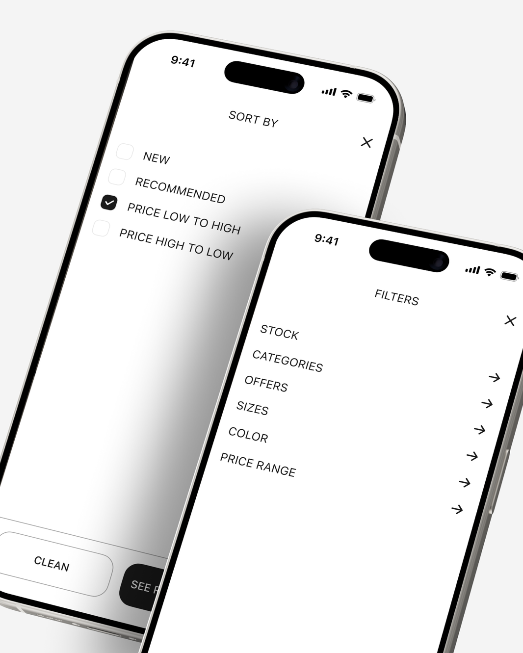
Case Study · UX Audit + Product Redesign
UNIQLO App Redesign
This project consists of redesigning the app for Japanese clothing brand UNIQLO. Despite being known for its minimalist designs and high quality, its app has confusing navigation with too many layers, as well as simulating a website embedded within an app with too much visual noise.
Project Details
This project proposes the UX/UI redesign of the UNIQLO app as a case study focused on auditing, decision-making, and measurable product improvement. It starts from a realistic brief: the app has good adoption, but it has problems with clarity, complex navigation, and difficulty understanding the products, which negatively impacts the shopping experience.
Methodology to be followed
The project is structured into five major phases.
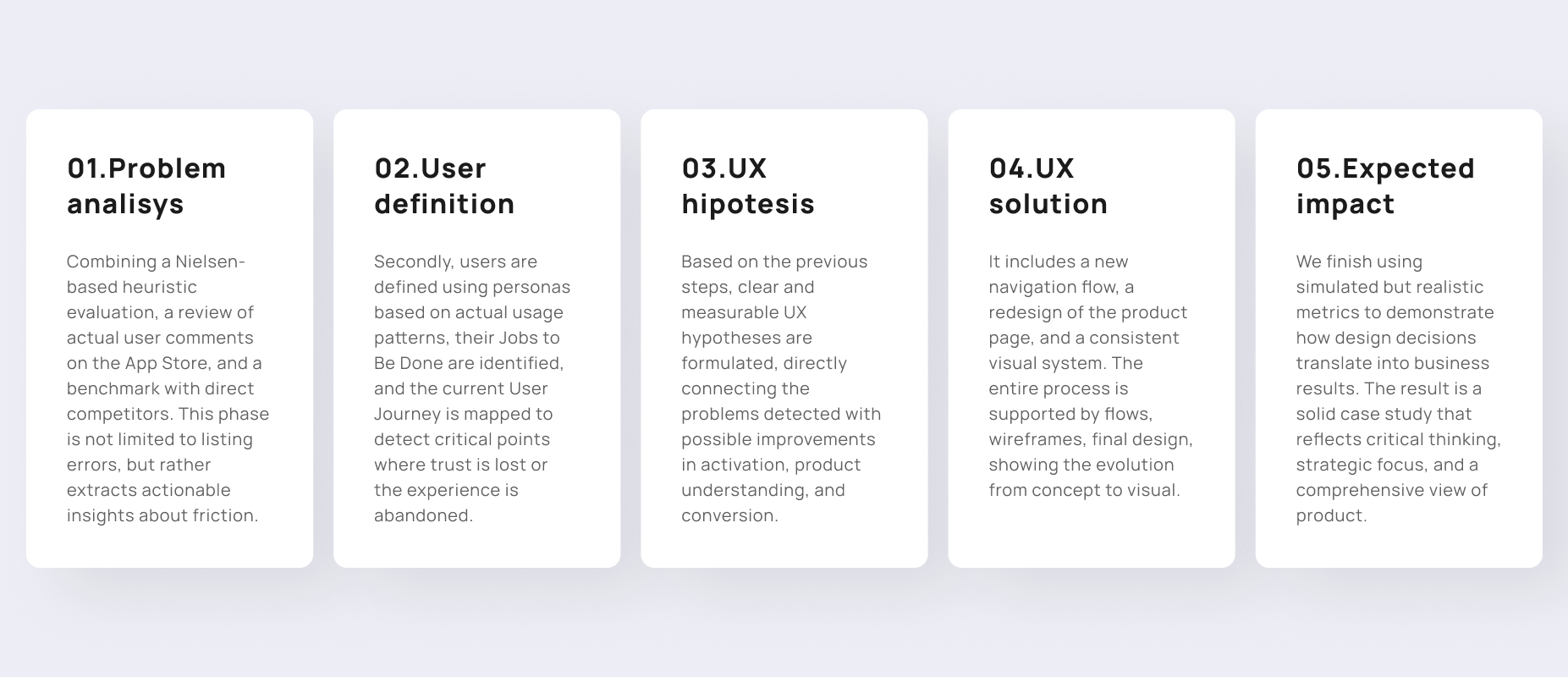
01. Problem analysis
Firstly, I conducted a heuristic evaluation exercise. Although the brand is a leader in minimalism and efficiency in its physical stores, its app has historically been criticized for being a “hybrid” (a website embedded within an app). This expert evaluation based on Nielsen's 10 heuristics, prioritizing severity and impact on conversion. The key findings I have discovered are as follows:
- System status visibility & user control: one of the biggest flaws is the navigation flow. Sometimes, when you enter a category and want to go back, the app takes you to the main menu instead of the previous subcategory. In addition, canceling an order you just placed from the app is often a complex or non-existent process.
- Recognition over recall: the app saves your search history and recent purchases, which is helpful. However, the category menus are so deep and hidden that sometimes you have to “memorize” where a specific section was. In addition, there is too much information in the product listings.
- Minimalist aesthetics and design: visually, it follows the brand's aesthetic (clean, white, and red). But there is an “excess of information.” Often, promotional banners saturate the screen and hide the products, breaking the minimalism they preach.
“The UNIQLO app does not pass the test with flying colors. Although it has advanced technological features, it fails in the most basic rules of usability, such as Consistency and User Control.” They have tried to be so innovative in their navigation that they have forgotten that users already have habits learned from other apps. If you have to “learn” how to use a clothing app, heuristics tells us that something is wrong.
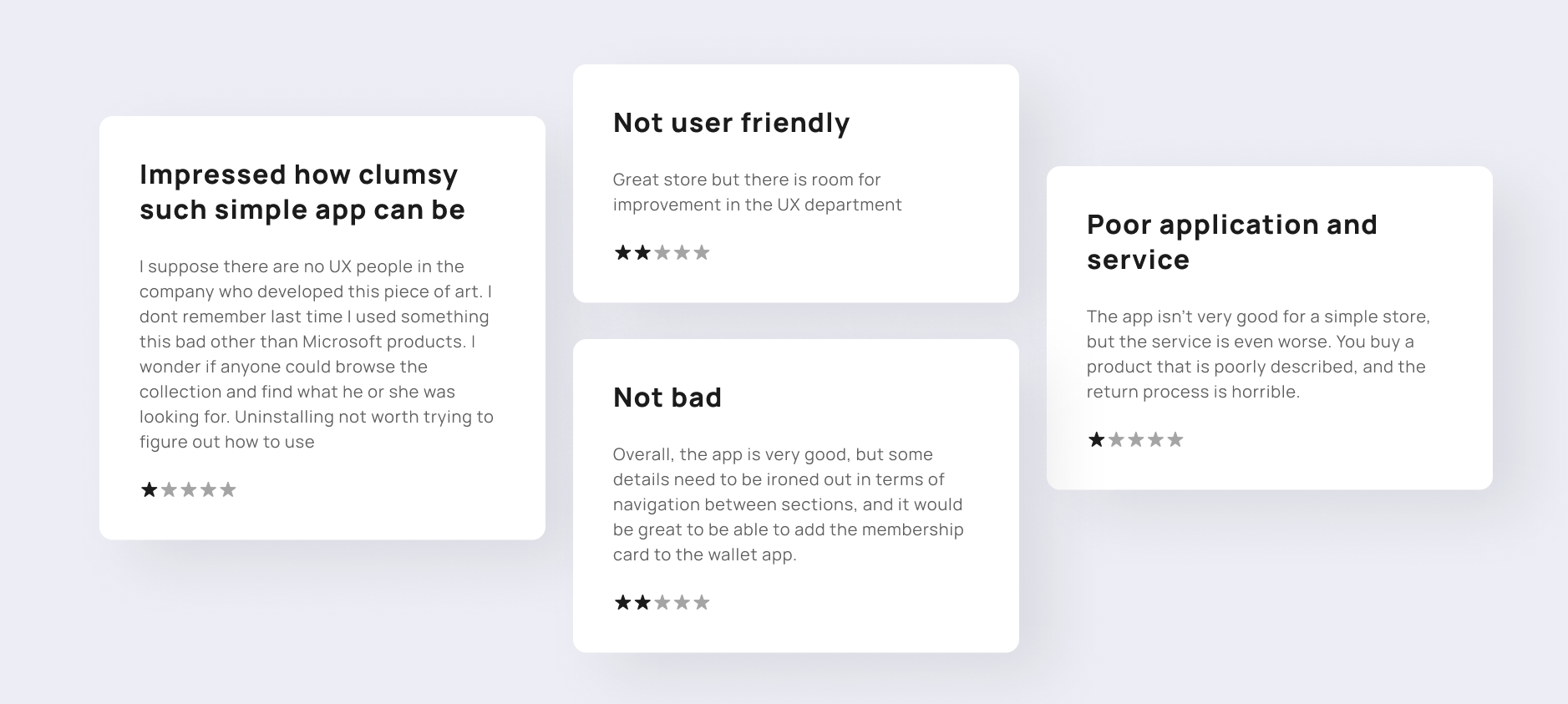
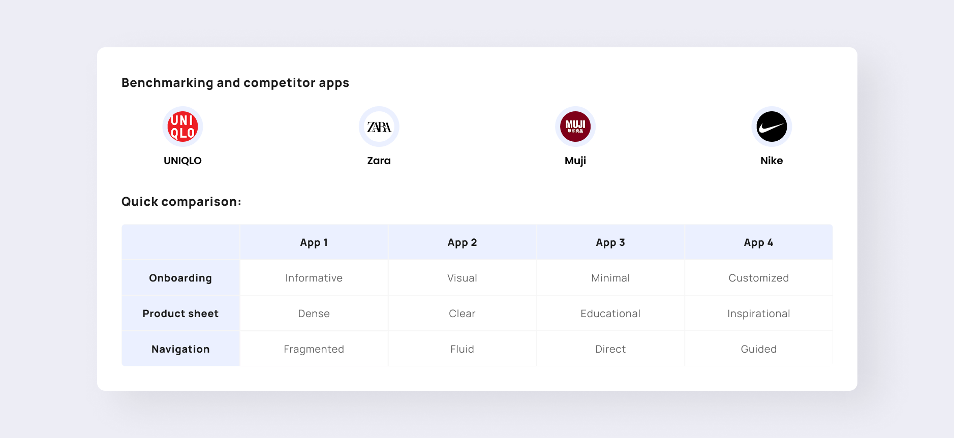
As part of this analysis process, I have reviewed actual comments on the app in the App Store/Play Store, as well as conducting a small benchmark comparing globally known brands such as Zara and Nike.
02. User Definition
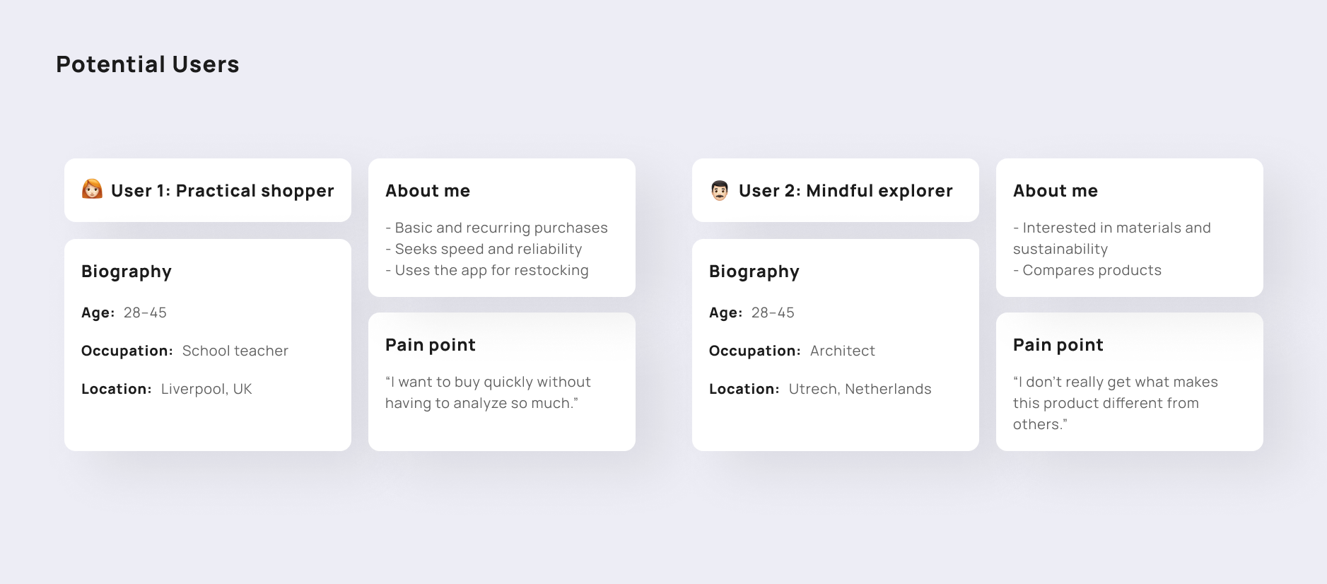
To optimize the user experience on our platform, I have identified two key user profiles with opposing needs. On one hand, there is the Practical Shopper, who prioritizes speed and efficient restocking; on the other, there is the Conscious Explorer, who seeks in-depth information and product differentiation. Identifying their specific pain points will allow us to design an interface that balances speed with detail.
Once I had defined the user personas, I moved beyond superficial characteristics and focused on the Jobs To Be Done. My goal was to understand what “mission” the user is trying to accomplish when they log into the platform. I discovered that, beyond buying clothes, the user seeks security and efficiency. On one hand, there is a critical need to verify the fit and size before checkout to eliminate the fear of returns; on the other, the user wants a navigation experience that allows them to explore the catalog seamlessly, without feeling lost.
Ultimately, the “job” the platform must perform is to filter out the noise so that the user can quickly find basics, feeling that they have total control over their decision from the very first click. Before formulating a hypothesis, I identified a series of friction points that disrupt the natural flow of the purchasing process. The analysis revealed that the experience begins with a homepage lacking a clear focus, forcing users to navigate through an overly complex section structure. This disorientation is exacerbated upon reaching the product page, which is overloaded with information, making it difficult to extract the truly relevant data. The biggest obstacle appears right before adding to cart: an unnecessary friction point that cuts off the impulse to buy.
03. UX Hypothesis
After identifying the friction points in the current process, we formulated a central hypothesis: simplifying the cognitive load and clarifying the decision-making flow will have a direct impact on user retention and conversion. To validate this hypothesis, we focused on three strategic areas:
- Value-driven onboarding: reduce the initial steps to communicate the app’s immediate benefits and thereby minimize early drop-off.
- Home page hierarchy: structure the home page with a clear visual focus that facilitates intuitive exploration of the catalog.
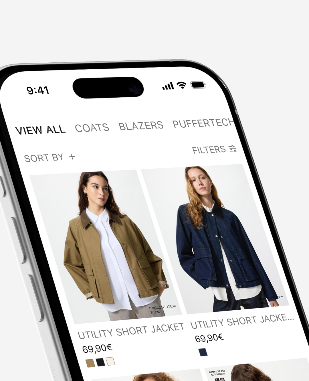
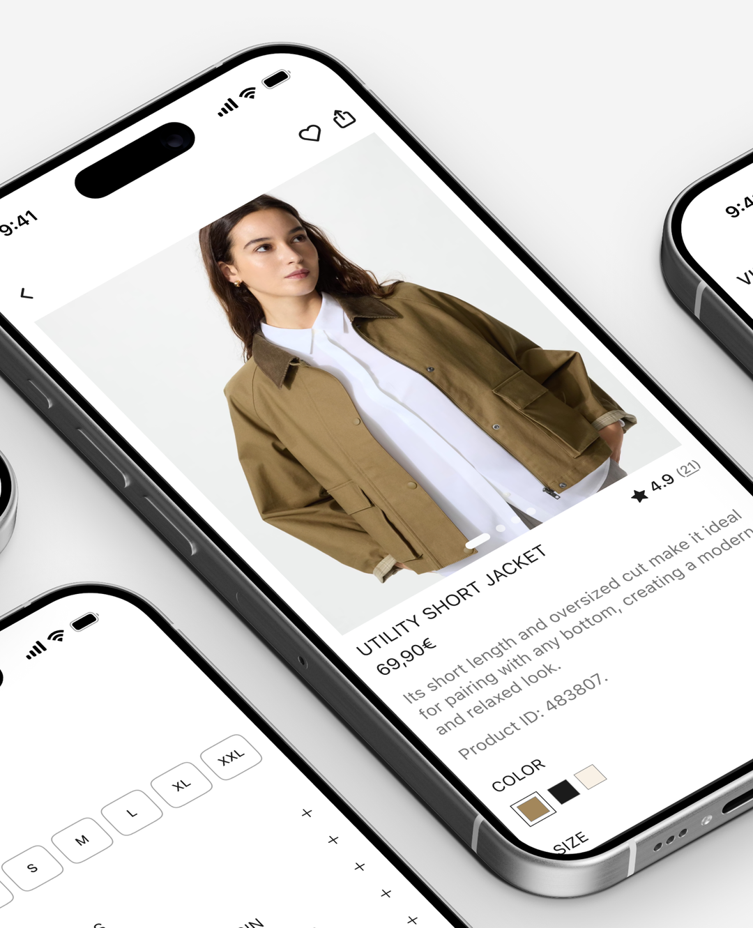
- Concise product listings: simplify technical information to enable quick product evaluation, driving the purchase decision.
Conclusion of the assessment: “The main problem is cognitive overload. Currently, the system requires users to make too many decisions before they’ve built up enough trust to proceed, which directly leads to a loss in conversion rates. If we simplify navigation, organize product information into a clear hierarchy, and align the design with the brand promise, users will make purchases more quickly and with greater confidence.”
04. UX Solution
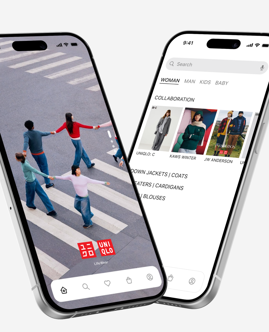
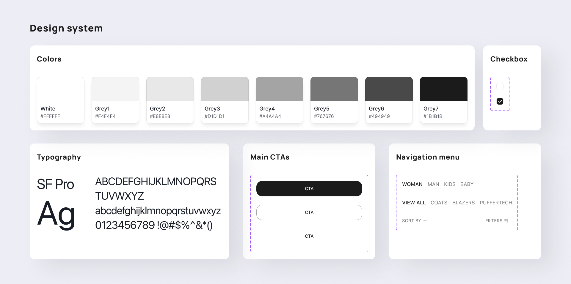
After defining the strategy, I moved on to the high-fidelity phase. Here you can see how the information architecture takes shape through final mockups designed to be intuitive and accessible. To ensure the product’s consistency and scalability, I built a Design System (a sample of which you’ll see below) that governs every component. I’d like to invite you to explore the original file.
For this project, I developed a comprehensive design system focused on usability and visual harmony. The system is based on the principles of Apple’s Human Interface Guidelines, ensuring a native, intuitive, and accessible experience for iOS users. From a typographic architecture based on SF Pro to a palette of refined neutrals, every component—including dynamic carousels, interaction states, and navigation—has been designed to be modular and scalable. The result is a clean interface that prioritizes content and facilitates smooth navigation, reducing cognitive load and strengthening the brand’s visual identity. Here you can explore the complete documentation and component architecture of my Design System.
05. Expected Impact
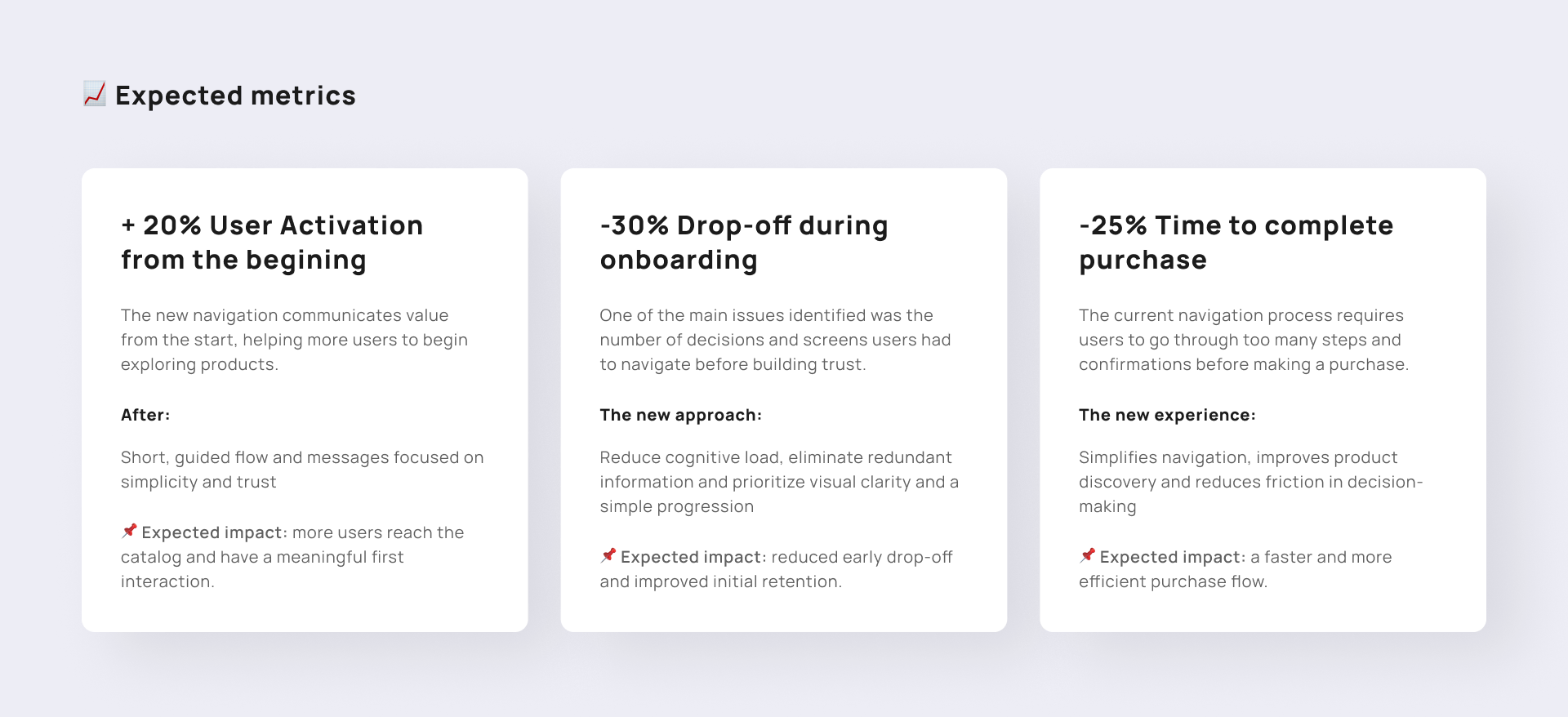
The goal of this phase is to demonstrate how the proposed UX/UI decisions not only improve the visual and navigation experience but also have a direct impact on product and business metrics. Although this is a conceptual case study, the metrics presented are based on issues identified during the audit and on standard performance benchmarks for mobile e-commerce. The proposal aims to reduce friction at critical points in the user journey: onboarding, catalog exploration, and product understanding. To this end, each design improvement is linked to an expected and measurable outcome.